https://www.codecademy.com/learn
http://www.kdnuggets.com/2015/03/the-grammar-data-science-python-vs-r.html
http://www.kdnuggets.com/2015/03/the-grammar-data-science-python-vs-r.html/3
In this post, I will elaborate on my experience switching teams by comparing and contrasting R and Python solutions to some simple data exploration exercises.
Python underperforms once more
The equivalent Python code does not read like English and is super annoying to write:
rand_ind = random.sample(diamonds.index, int(diamonds.index.shape[0]*.50))
diamonds_sampled = diamonds.loc[rand_ind]
diamonds_sampled['volume'] =
diamonds_sampled.x * diamonds_sampled.y * diamonds_sampled.z
diamonds_sampled =
diamonds_sampled.loc[:, ['cut', 'carat', 'price', 'volume']]
sns.pairplot(diamonds_sampled, size=2.5)
The output is also far less awesome and far less informative:
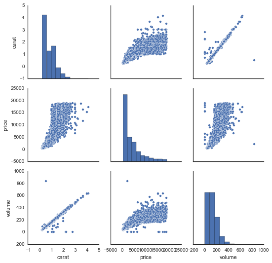
There are some big issues here. First, the pairplot command from Seaborn dropped the variable cut, because it did not know how to compare it to the continuous variables. It can only plot scatter plots for continuous vs. continuous variables. Second, the upper triangle of this grid of plots is redundant (e.g., the top right plot is the same as the bottom left plot). In R, these redundant plots are replaced by correlation coefficients or grouped boxplots, which add information. Finally, I found the aesthetics of the figure in Seaborn way too difficult to control, hence the price labels on the x-axes are bunched together. Again, the ggplot+dplyr code is easier to read, easier to write, and produces an informative visualization with intuitive code patterns.
Both languages are great for different reasons
I’m a huge fan of doing exploratory data analysis/visualization in R using ggplot2 and dplyr. Using these tools, I find it straightforward to translate my ideas from English into code and visualizations. The analogous process in Python is usually more convoluted, and the results are not nearly as pleasing to the eye or as informative. I’ve found that the ease of working in R greatly enhances my creativity and general happiness.
That being said, R also has some pretty huge drawbacks relative to Python. The language is byzantine and weird, and anytime I leave the magical world of dplyr and ggplot I start to feel the pain. Furthermore, I find it hard to automate workflows, or build reusable code. My current strategy is to leverage the best of both worlds — do early stage data analysis in R, then switch to Python when it’s time to get serious, be a team player, and ship some real code and data products.
Original: http://technology.stitchfix.com/blog/2015/03/17/grammar-of-data-science/
Bio: Deep Ganguli is a Machine Learning Engineer at Stitch Fix, where he build big data infrastructures and machine learning modules to accompany them. He is interested in neuroscience (his doctoral work) and how an understanding of the brain can illuminate better machine learning algorithms
No comments:
Post a Comment